
I help businesses to present their services the way people want to see it.
Case Studies
New Websites
Some websites are created 10 years ago, some are my latest works.


Case study 1. Real Estate School
Old website. They knew something is unbalanced:
the guidance can be better
too complected
overall banding is off
Goal: Organize it. $500
New website. Same information but organized.
uniqueness
benefits
how to attend the school
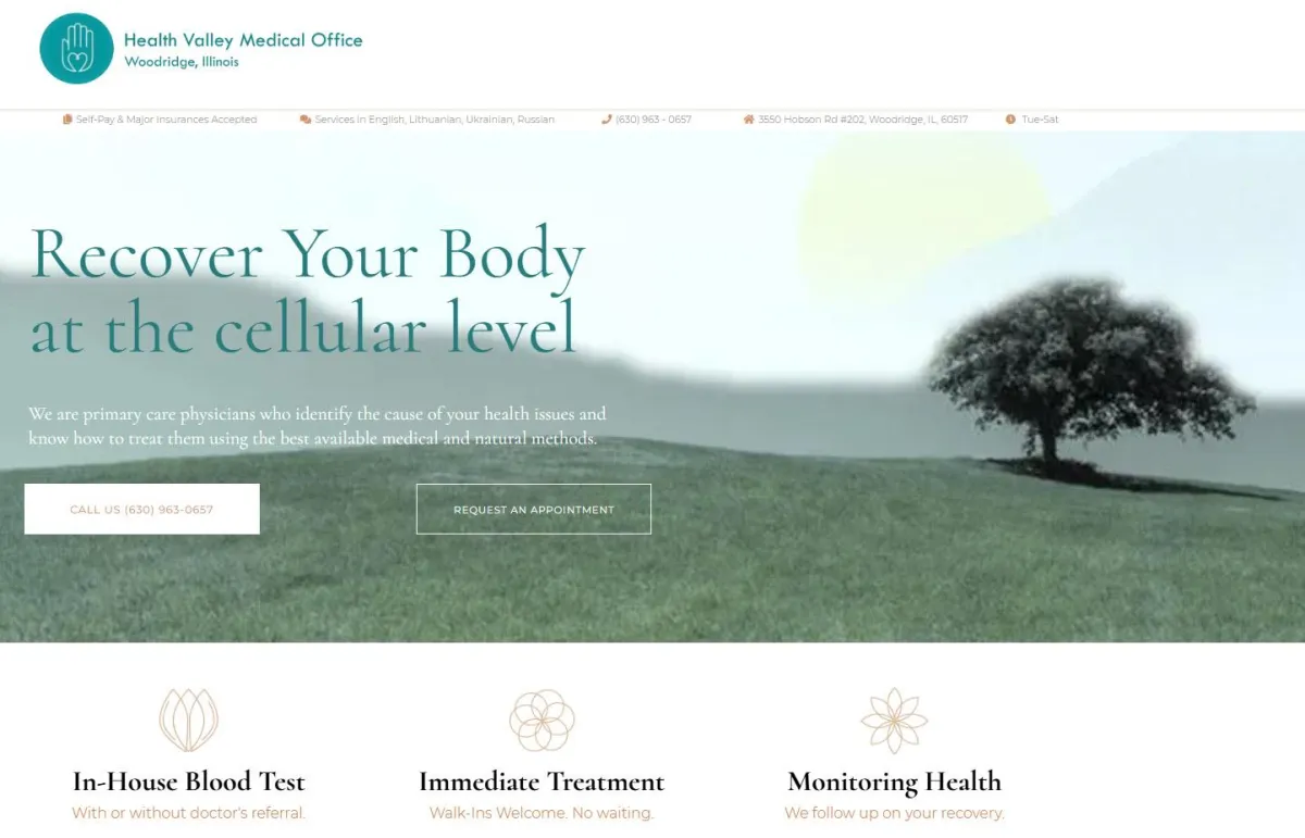
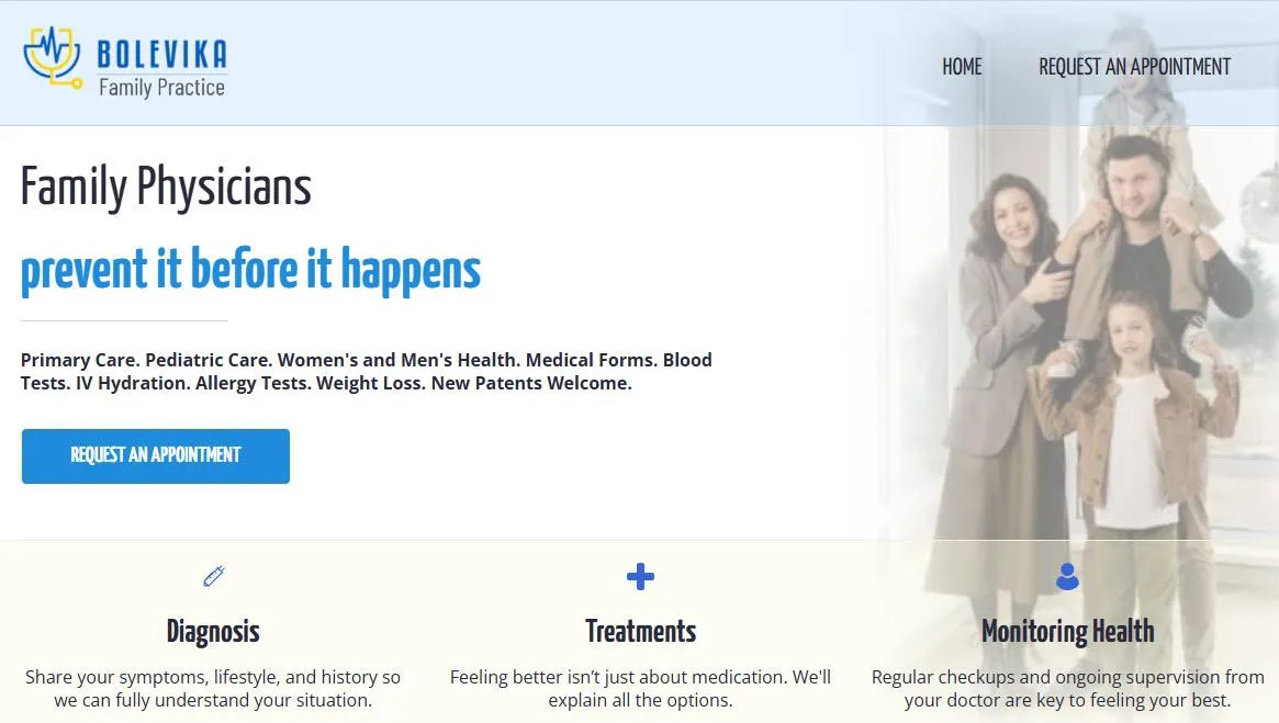
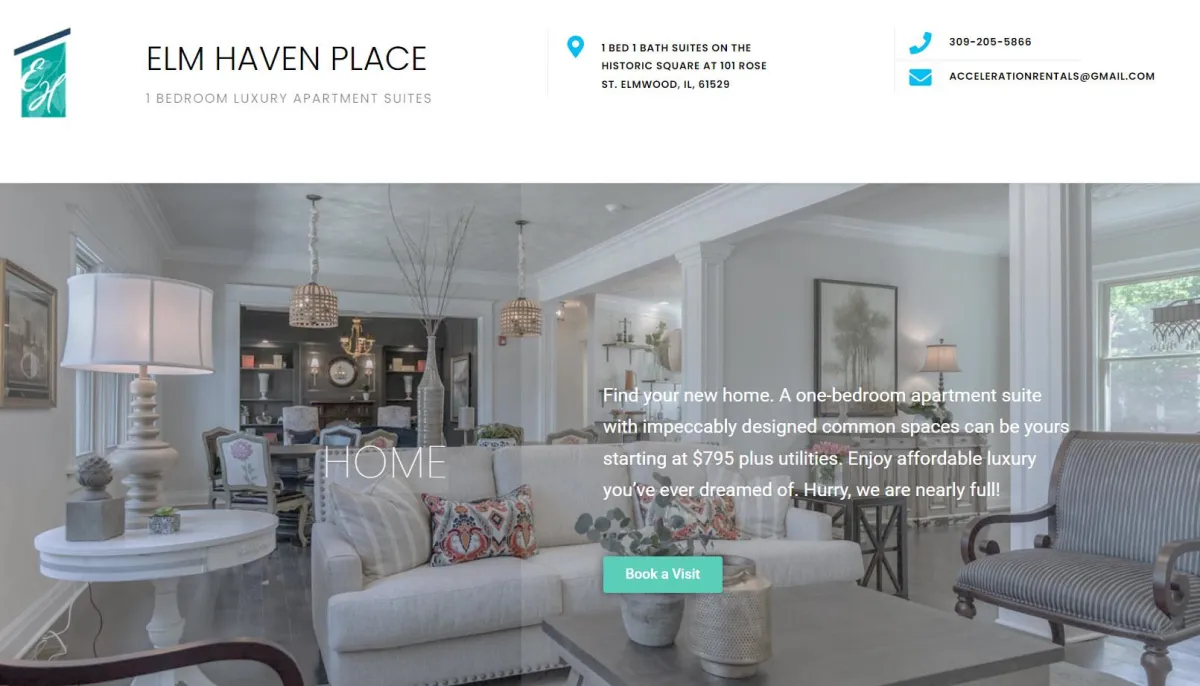
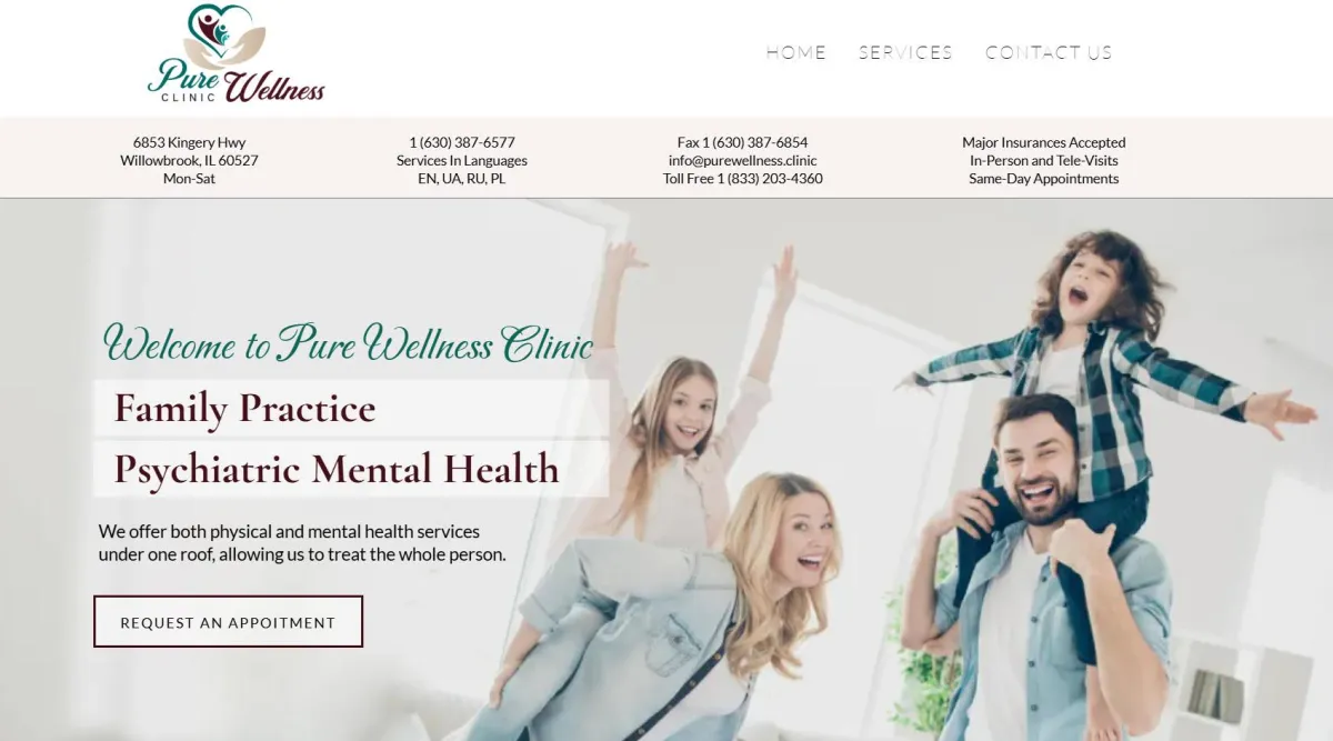
Case study 2. Doctors Office
One of the worst websites I've ever encounter:
links don't work
who they are what they do?
"Comprehensive", "personal" at doctor's office is expectation, not uniqueness.
Goal: A new website. $1500
I kept the logo. All brand-new information with forms and automated messages.
it's clear what they do
how they do
where to find them.
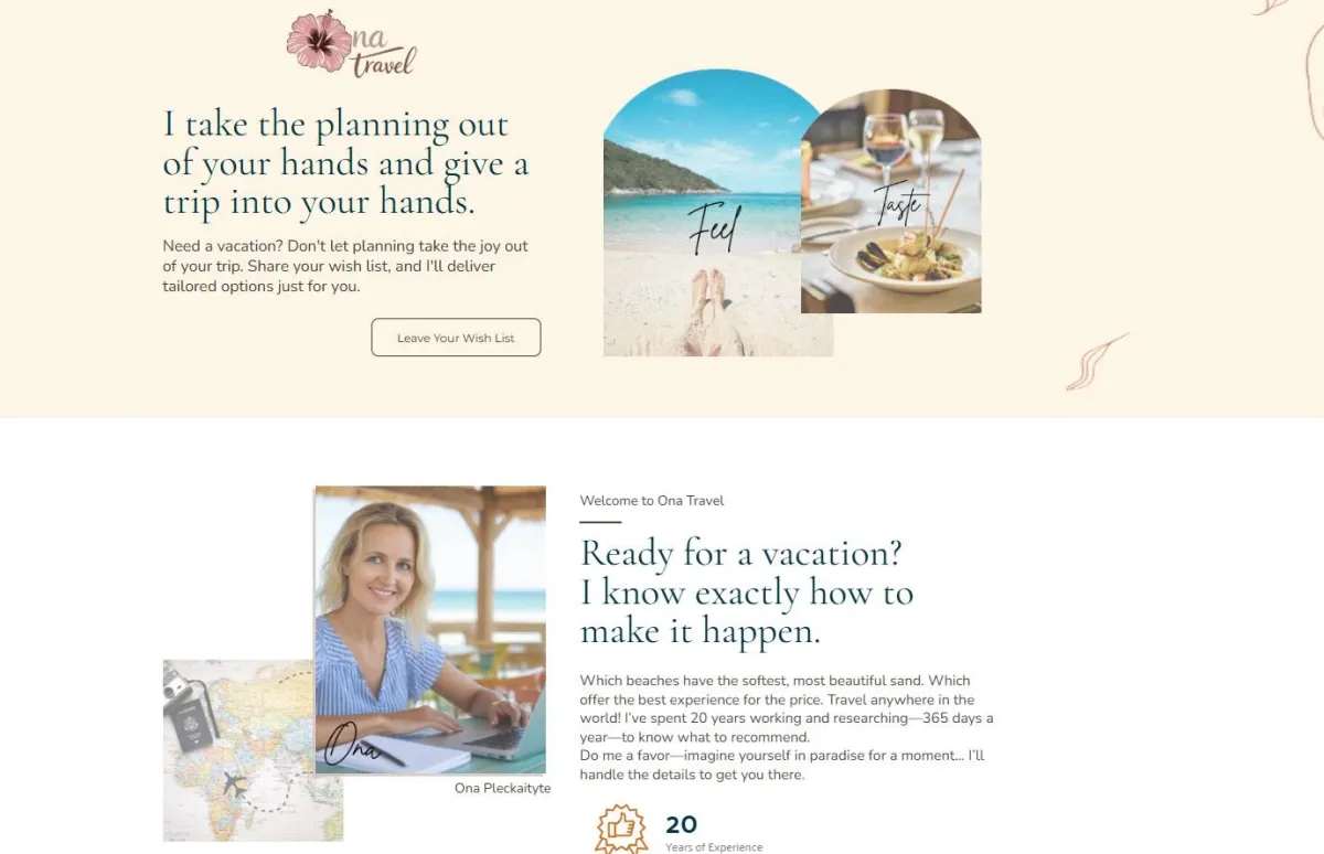
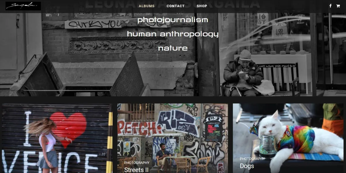
Case study 3. Wedding Photographer
The original website had a light background with some information and images. Basically, it only needed to be polished, but the photographer wanted a brand new one with a dark background. He ended up doing it himself. This is his version. There are a few big mistakes in it.
Goal: A branded website. $2000
The website uses a lot of elegant words and is all about her and her day. It is organized, and the images speak for themselves. The biggest mistake business owners make is talking too much about themselves. Clients want to hear how their photographer will make them look beautiful.
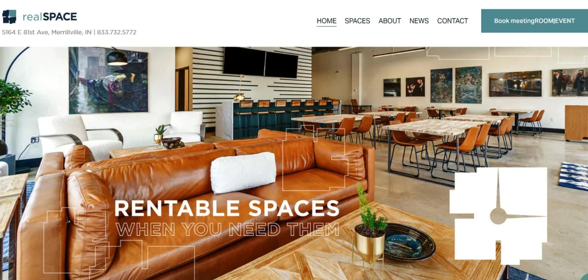
Case study 4. Realty Website
$1000
A real estate website doesn't need to start with a search engine. Instead, it should lead visitors straight to a well-designed landing page. Why send potential clients into confusion with endless listings, when real estate agents can simply collect their wish lists and start building a relationship? It’s about making the process easier, more personal, and ultimately more effective.
Case Study 5. One-page Websites
$500
Simple, strait to the point websites that highlights uniqueness, credentials, and contact information.
Some websites are created 10 years ago, some are brand new.
New Websites
Testimonials
What my clients say

I like the colors, the layout. Exceeded my expectations.
Doug S.
Start-up
The pricing is great. I couldn't do better myself.
Ashley S.
Marketer
I showed my new website to everybody. Everyone likes it.
Giedre B.
Director
P.S. What is the mindset behind website creation?

CRM SOFTWARE
I help business set up marketing systems on BizAteleir.co software. Ula Davitt, Marketing Director
© 2025 BizAttelier.co. All rights reserved.